MAGI Design System: Driving Consistency & Efficiency
Unifying User Experience at GO Instore
Luca Perrone | Head of Design and UX
Key Focus: Revolutionizing product usability, accessibility, and consistency through a scalable design system.
My Contribution to MAGI
Vision & Strategy: Defined the strategic roadmap for MAGI, aligning it with overall product and business goals.
Team Leadership: Built and mentored the design team responsible for MAGI's creation and adoption, focusing on hands-on design and continuous improvements.
Cross-Functional Collaboration: Facilitated seamless collaboration between design, product, and engineering.
Advocacy & Influence: Championed the design system's value to senior stakeholders (CEOs, VPs) and secured necessary resources.
Operational Excellence: Established processes for maintenance, governance, and continuous improvement of the system.
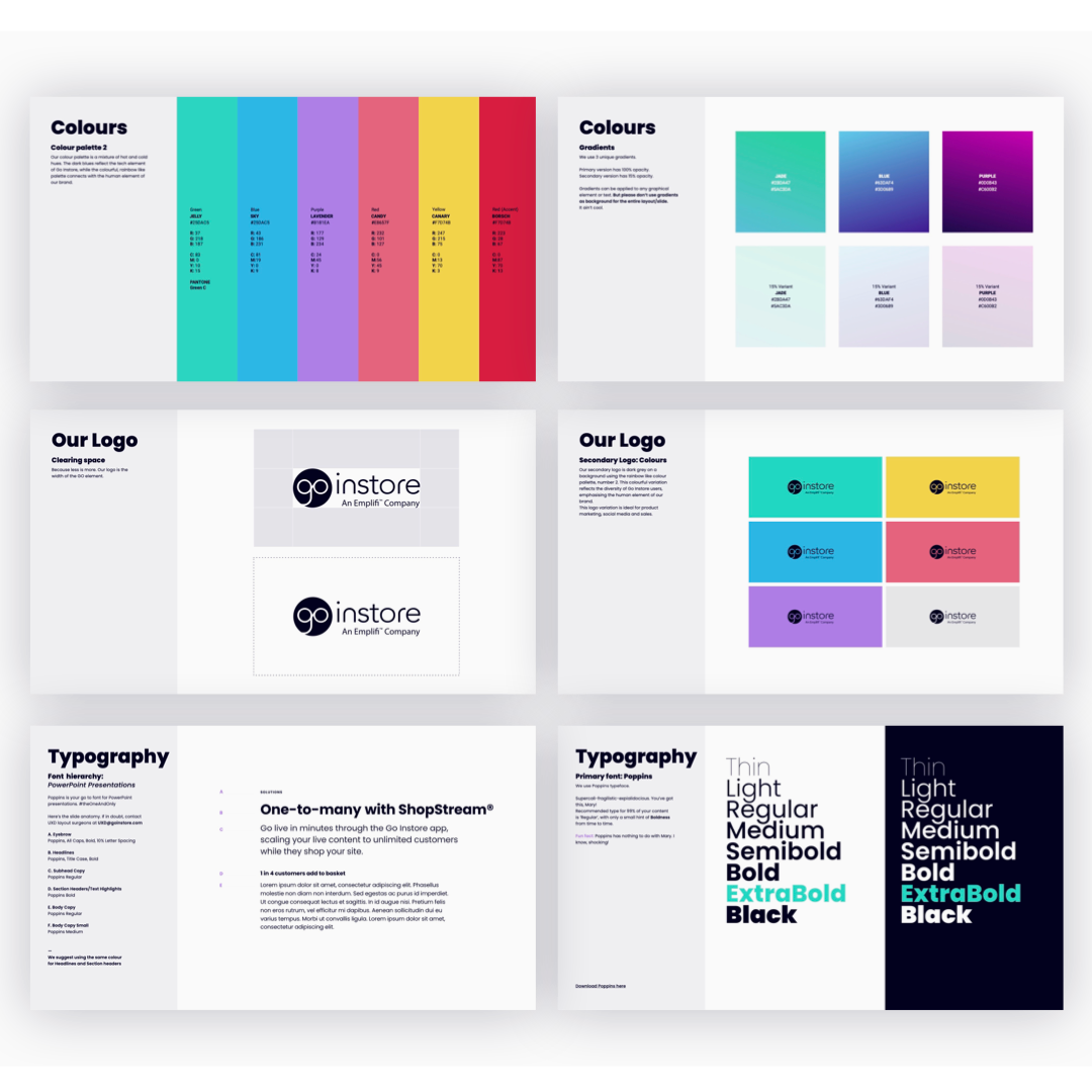
Go Instore Brand guidelines
1. The Challenge: Why MAGI?
Inconsistent User Experiences: Fragmented UI across multiple platforms, leading to user confusion and a disjointed brand experience.
Inefficient Design & Development: Designers and developers spending excessive time recreating common UI elements, slowing down product delivery.
Scalability Issues: Difficulty maintaining quality and consistency as the product portfolio grew and new features were introduced.
Accessibility Gaps: Lack of a centralized resource to ensure WCAG and ARIA compliance across all interfaces.
Mobile-First Imperative: Critical need for a responsive system, especially with over 72% of users on mobile (as highlighted in the CTA project).
2. Design Philosophy & Principles
Building Blocks for a Better Experience
User-Centred Foundation: Prioritising user needs, pain points, and usability insights from research (user interviews, surveys, data analysis).
Consistency & Predictability: Ensuring a unified look, feel, and interaction across all digital products.
Accessibility by Design: Integrating WCAG and ARIA compliance directly into components, making inclusivity a core tenet.
Scalability & Maintainability: Creating a flexible and modular system that could evolve with the product and team, reducing technical debt.
Efficiency & Collaboration: Empowering designers and developers with reusable assets and clear guidelines to accelerate workflows.
"Mobile-First" Approach: Designing components and layouts with mobile users as a primary consideration, ensuring optimal performance and usability on smaller screens.
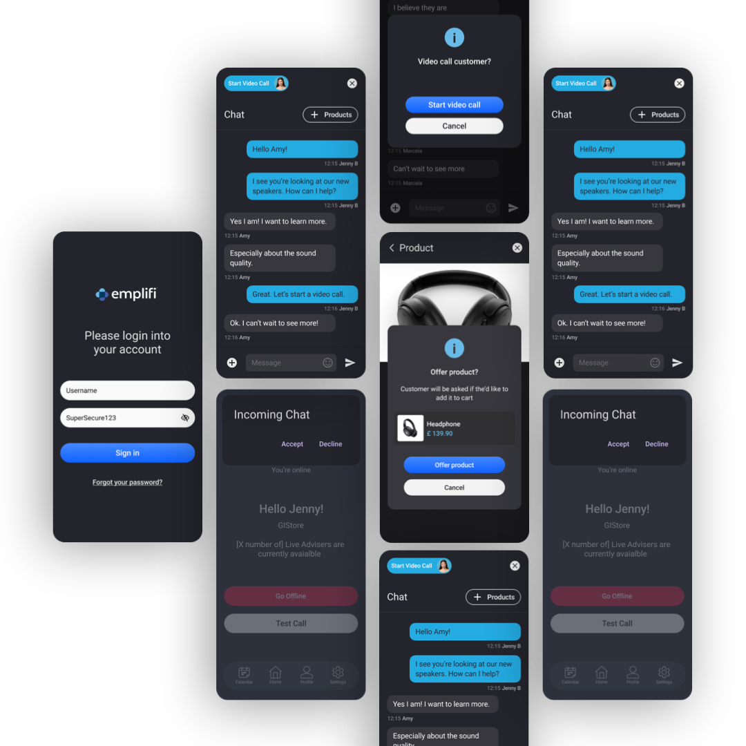
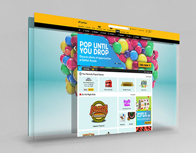
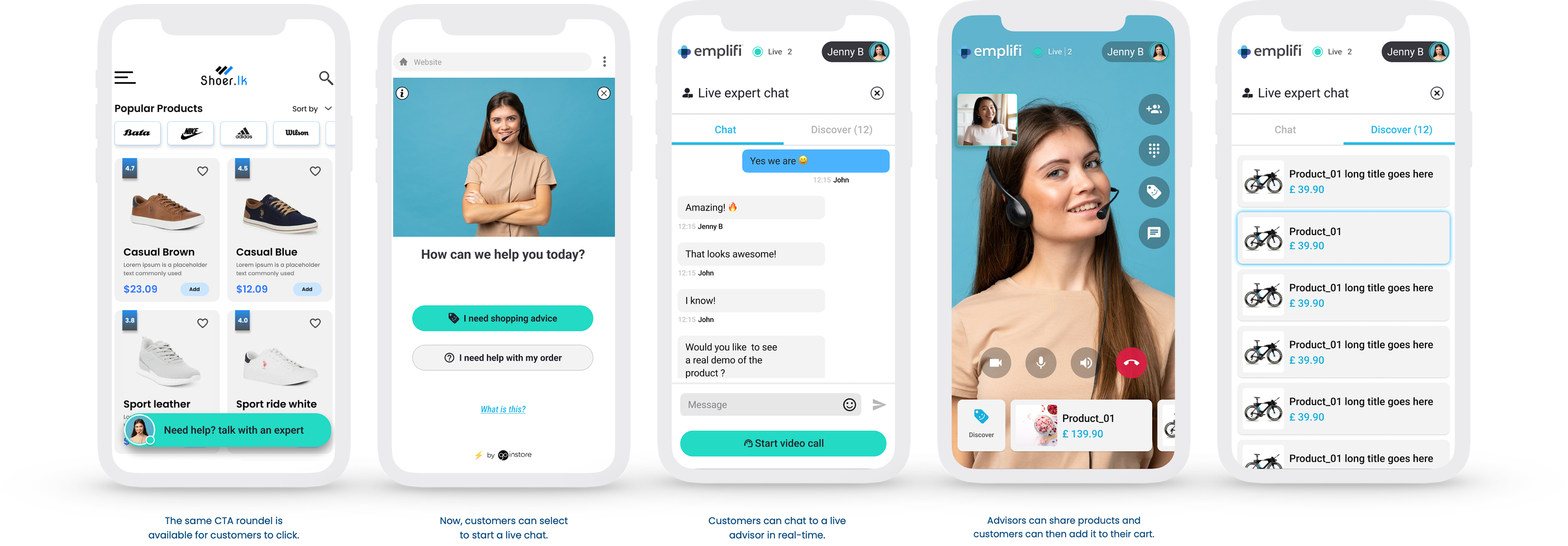
mobile screen chat and overlay templates
3. Key Features of MAGI
What Makes MAGI Powerful?
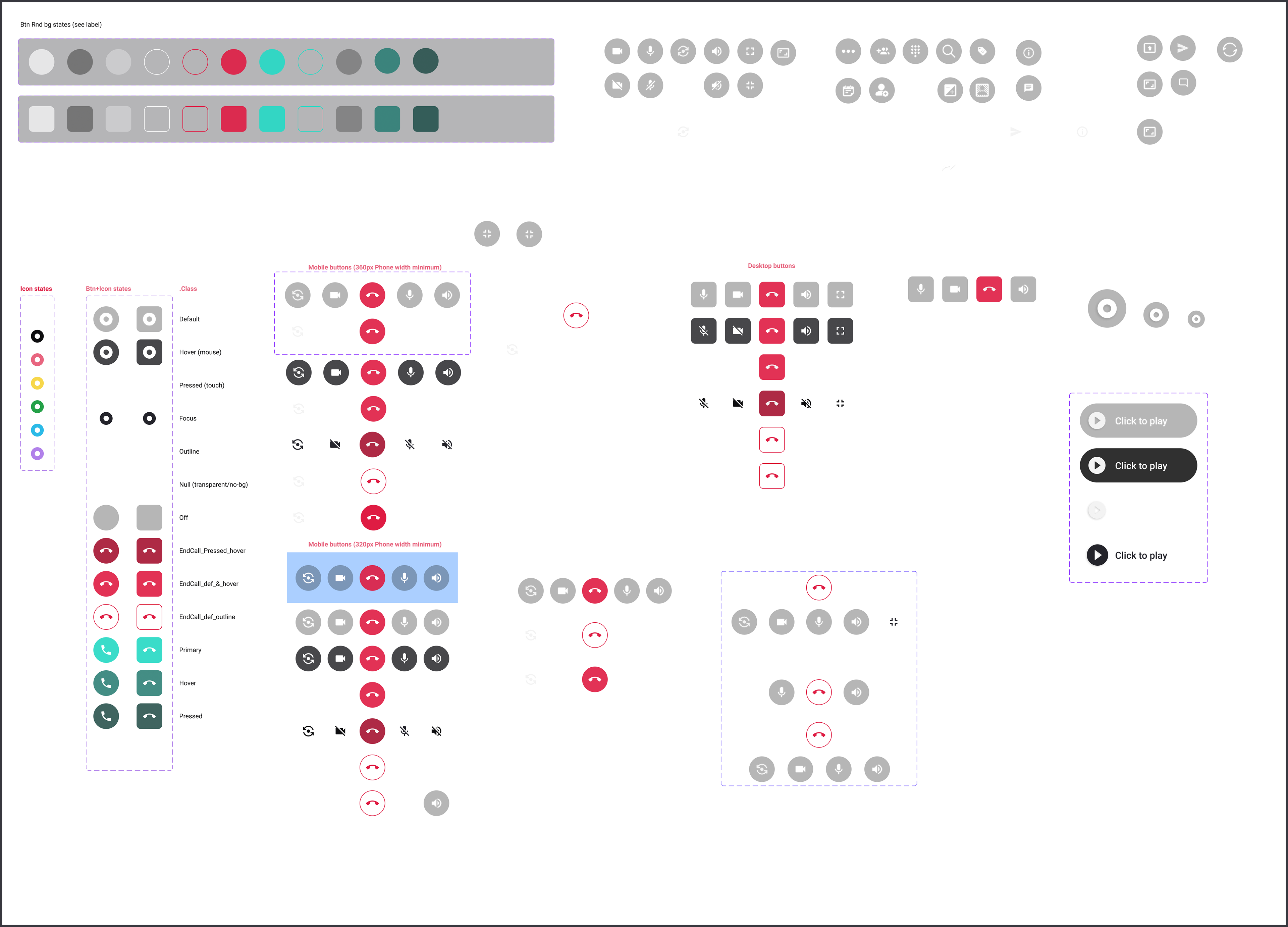
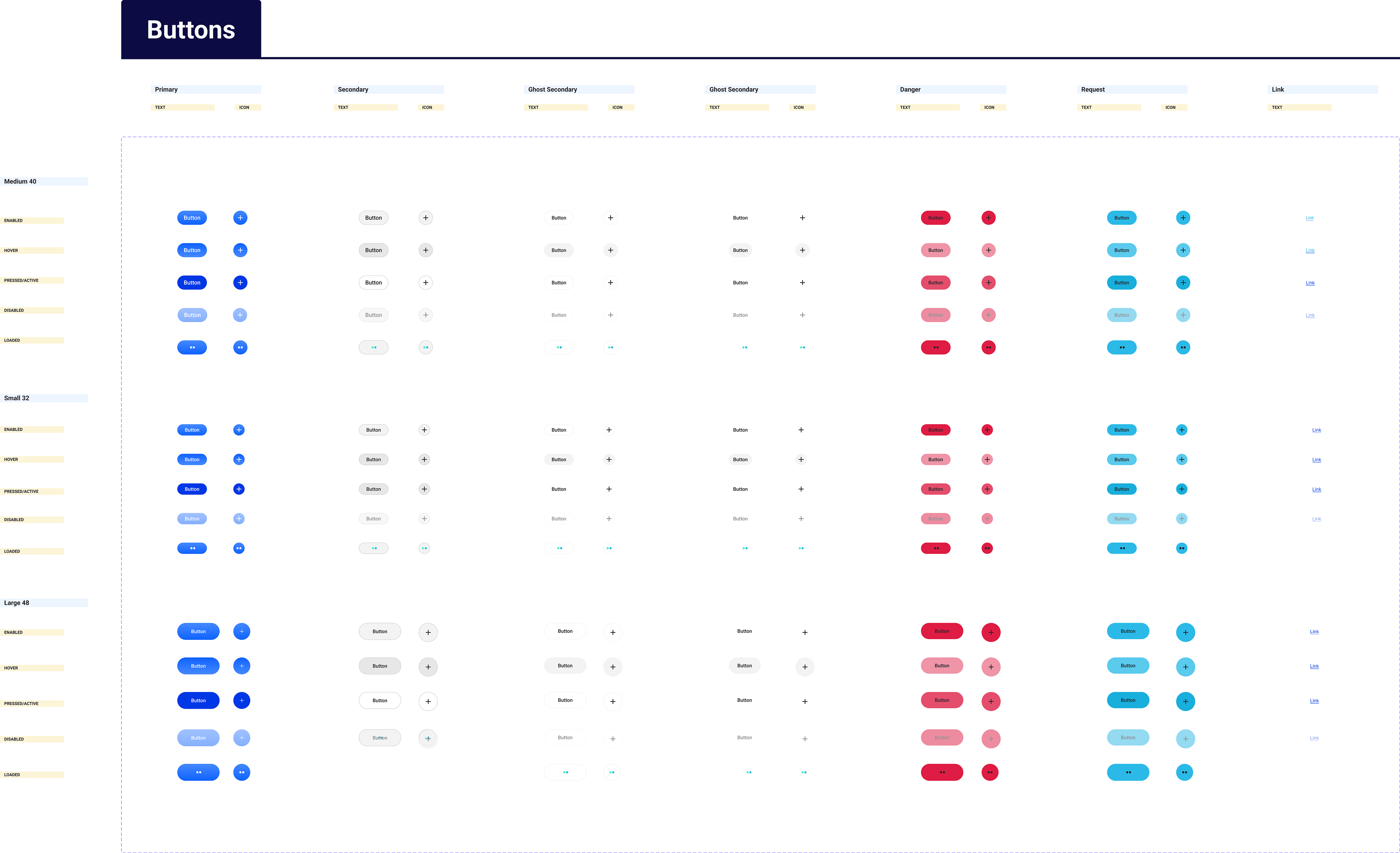
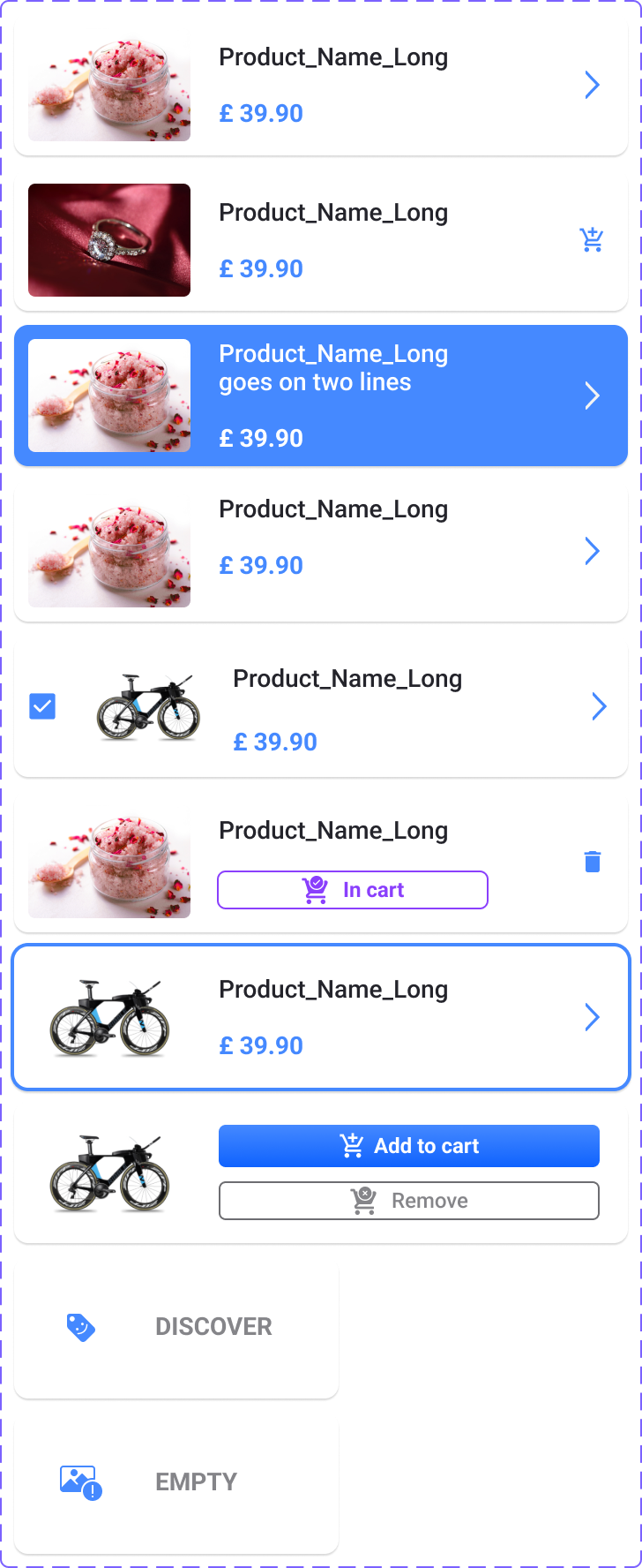
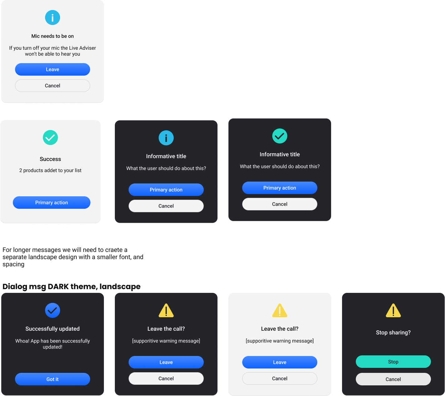
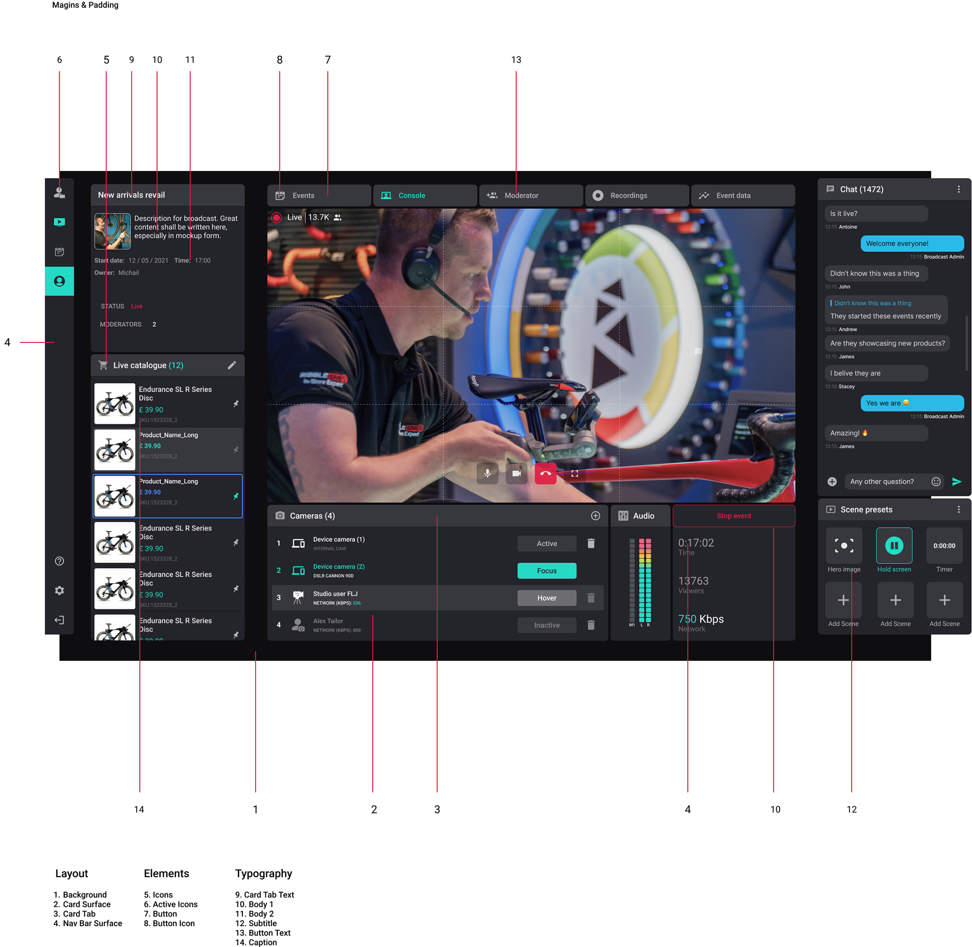
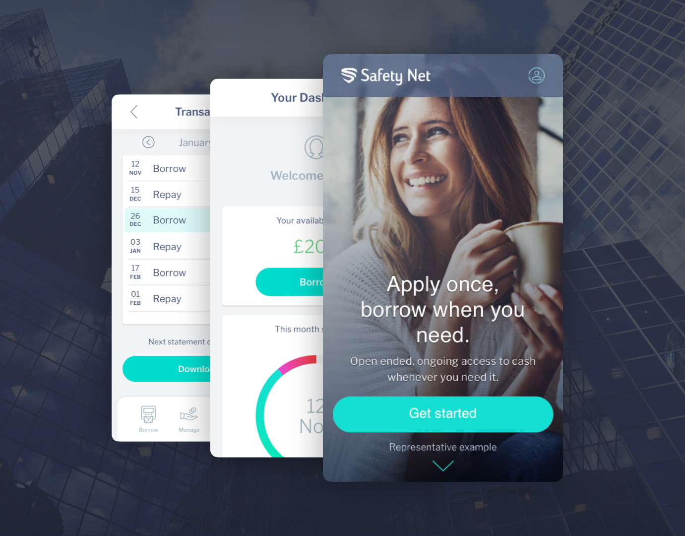
Comprehensive Component Library: A rich collection of pre-built, production-ready Angular UI elements (buttons, forms, navigation, cards, etc.), designed in Figma to facilitate seamless collaboration and integration with front-end development.
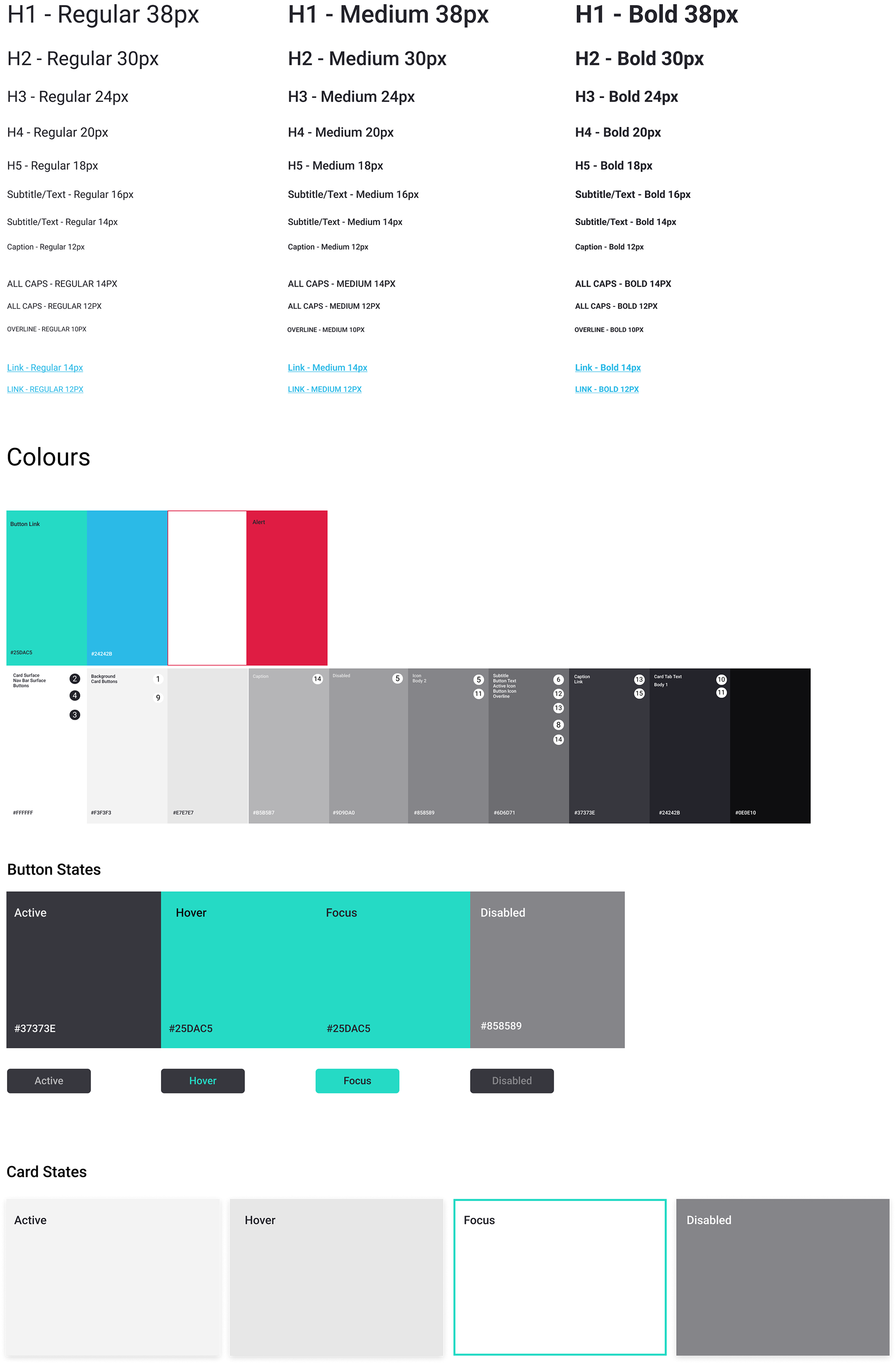
Token-Based Styling: Centralised control over colours, typography, spacing, and iconography for easy theming and global updates.
Responsive Design Patterns: Built-in responsiveness for seamless adaptation across desktop, tablet, and mobile breakpoints.
Accessibility Guidelines: Integrated best practices and usage notes for WCAG and ARIA compliance.
Version Control & Documentation: Clear versioning and detailed documentation within Figma for easy adoption and maintenance.
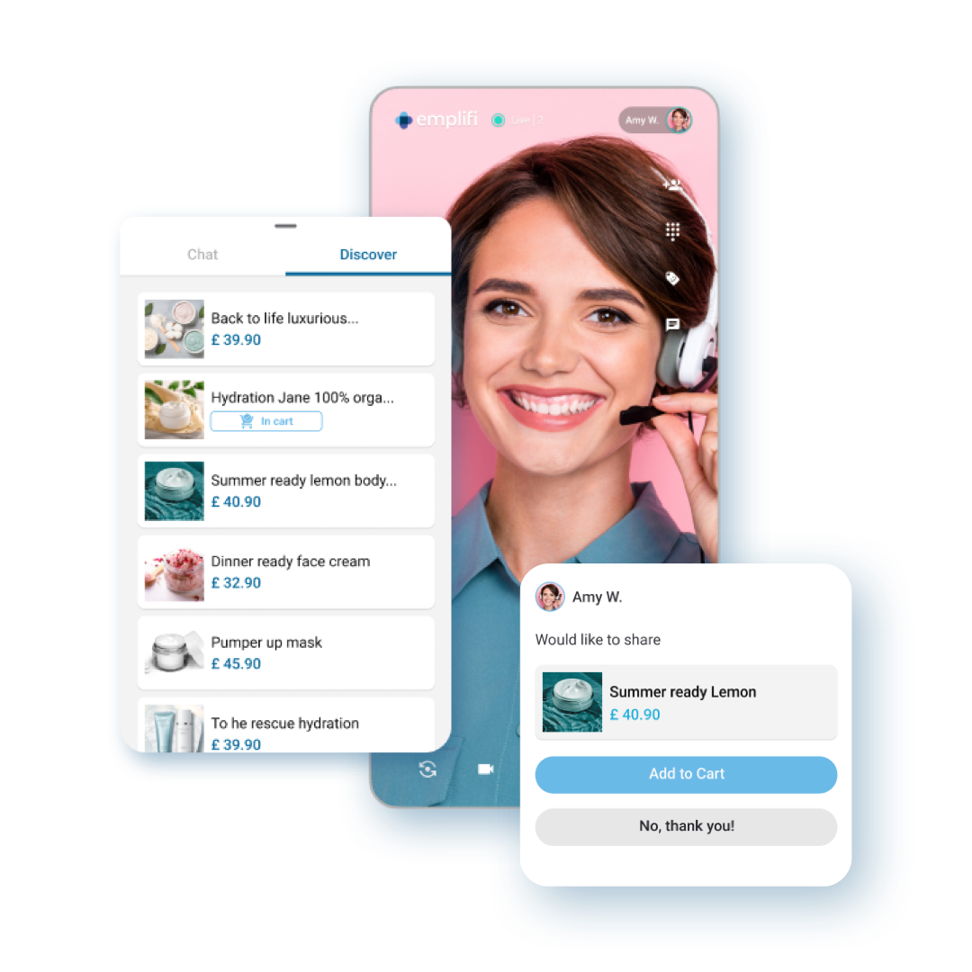
live video mobile product carousel
4. The Development & Design Process
How We Built MAGI
Phase 1: Audit & Research: Conducted a comprehensive audit of existing UIs, identified inconsistencies, and gathered user feedback on pain points.
Phase 2: Core Principles & Foundation: Defined design principles, established a token system (colors, typography, spacing), and created a foundational style guide.
Phase 3: Iterative Component Development: Designed, prototyped, and tested components in Figma, iterating based on usability testing and stakeholder feedback.
Phase 4: Collaboration & Adoption: Worked closely with engineering teams for implementation, provided training, and fostered self-regulating team habits (kick-offs, stand-ups, retrospectives).
Phase 5: Documentation & Governance: Created living documentation within Figma, outlining usage guidelines, accessibility notes, and contribution models.
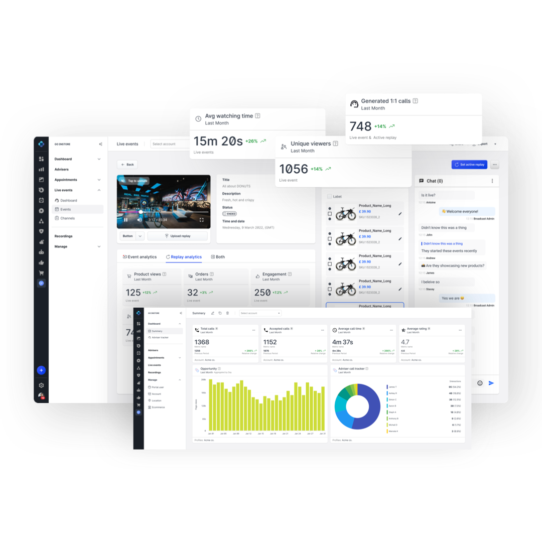
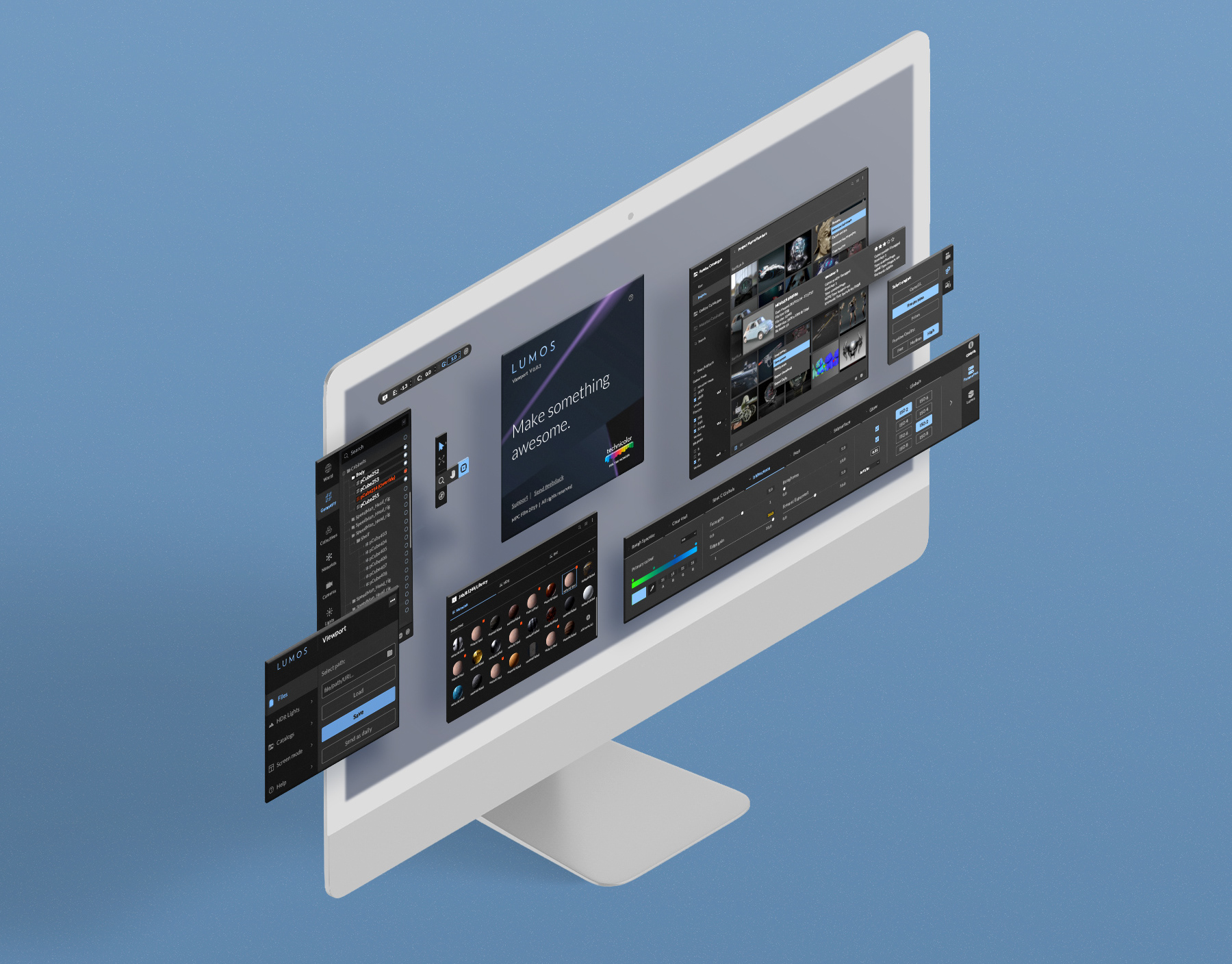
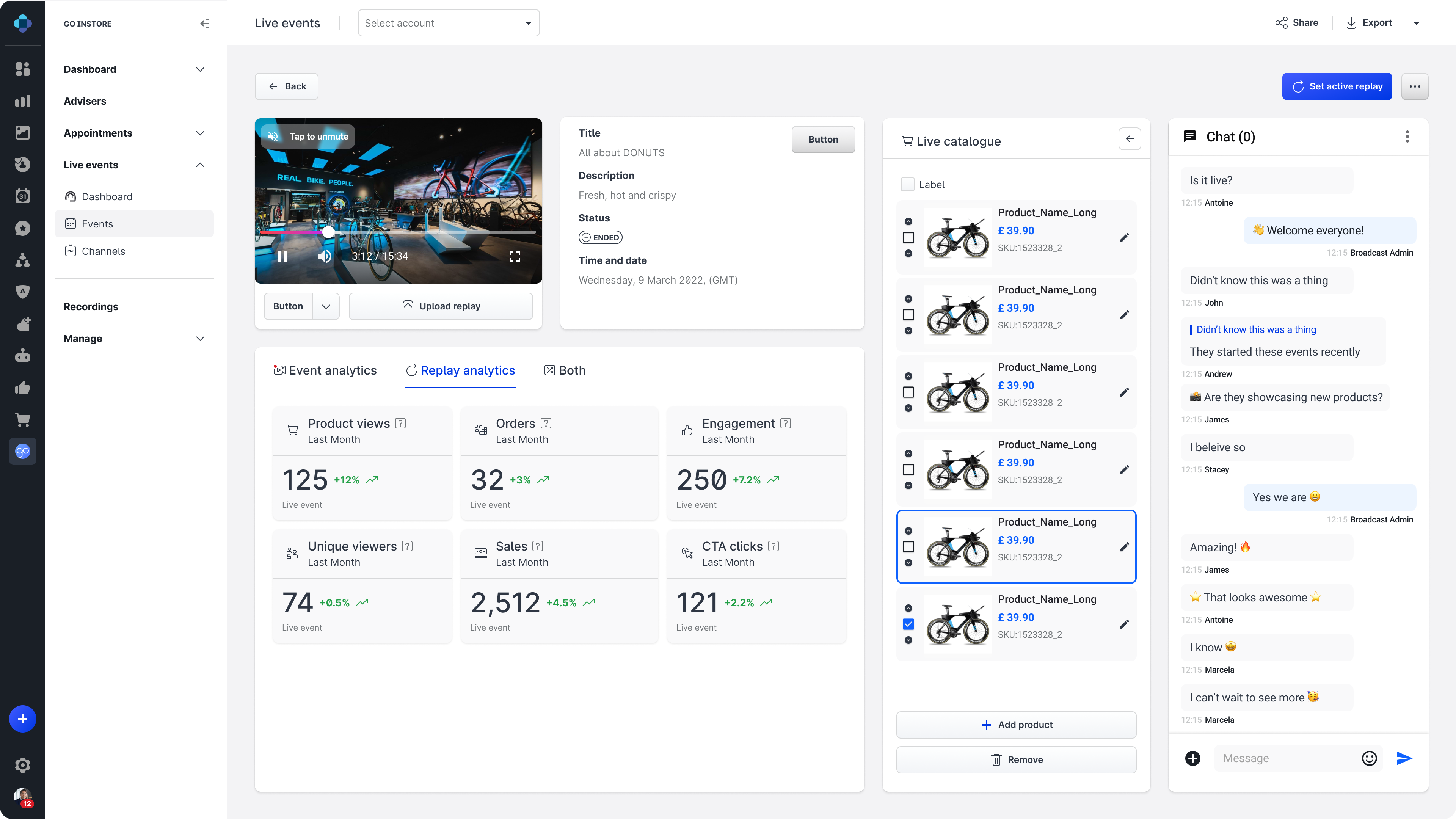
dashboard and portal template screen with side nav
5. Impact & Results
The Value MAGI Delivered
Increased Design & Development Efficiency: Reduced design time by 60% and front-end development time by 35%
Enhanced Product Consistency: Achieved a unified brand presence across all digital touch-points.
Improved User Experience: Better usability, clearer interactions, and reduced cognitive load for users.
Elevated Accessibility: Ensured higher compliance with WCAG standards, expanding reach to a wider audience.
Faster Time-to-Market: Accelerated the launch of new features and products due to reusable components.
Stronger Team Collaboration: Fostered a shared language and streamlined handoff between design and development.
Successful Integration: MAGI was successfully migrated and aligned with Emplifi's global design system, "Soul," demonstrating its adaptability and robustness within a larger organizational framework.


